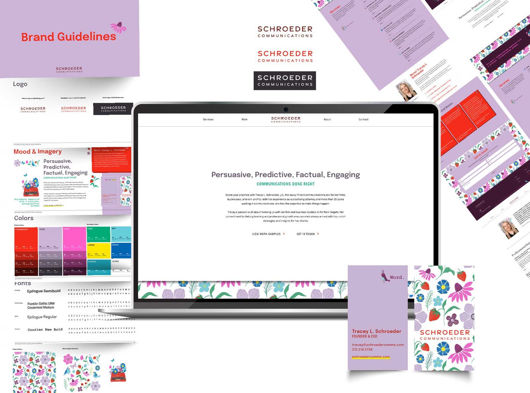
Schroeder Communications started by accomplished lawyer and entrepreneur Tracey L. Schroeder, is a brand new business that caters to helping others make creative and effective communications choices. Schroeder Communications offer a large variety of services, including guiding through legal frameworks, proofreading and editing, professional communications, public relations, marketing and branding, and event planning. They were seeking an extensive, in-depth branding design to get their new business up and running on a positive note.
Branding Design for a Comprehensive Communications Agency


Mood Board Development
View began to set the tone of Schroeder’s branding design with the creation of mood boards to determine the desired visual direction. View presented a variety of mood boards based on the initial conversations, all displaying slightly different moods and aesthetics. Once they had chosen their favorite theme, we could move on to finalizing the logo design.


Logo Development
Because of the colorful and dense design of the overall brand, we kept the logo design simple. The final logo design includes the name of the company, Schroeder Communications, in a clean, easily readable, modern font. We outlined three colorways for usage in myriad applications.

Branding and Brand Guidelines
When creating the branding design for this business, View wanted to make sure that it was bright, engaging and energetic to reflect the founder’s passionate, vibrant personality. The use of a variety of colors, the main palette being shades of purples, pinks, and reds, acted as the part of the brand that showcased the bubbly personality and love for creativity valued at Schroeder Communications. Graphic elements and patterns also became a key part of the branding design, using flowers and birds to add to the lively aesthetic. The vibrant colors and patterns were balanced out by the use of sans-serif, modern fonts, making the information easy to read. A collection of puns rounds out the brand, bringing a bit of humor and levity to the materials.


Website Development
Drawing back on the branding design and guidelines previously established, View began designing and developing the website. The site was built from the ground up using the Webflow platform, allowing for fun graphics, animations, and motion to be integrated. Because of the site’s responsivity to different devices and breakpoints, the user experience is great on any device.

Business Cards
The business cards are designed to cleanly communicate pertinent contact information while featuring a variety of smart puns. The back boasts a wallpaper-like treatment of the sweet floral and nature-focused graphic elements surrounding the logo.

Social Media
The final step of this branding design was to help get the word out about the new business on social media. The branding holds strong across platforms, visually representing both the impressive credentials of the founder as well as her fun, approachable personality.
Follow Schroeder Communications on social media:


